
Introducing CJ Type
Stephen Coles: When was the first time you noticed type as a designed thing?
CJ Dunn: I was definitely aware of letterforms at a very young age. My father went to architecture school and he introduced me to the drafter’s style of lettering, which he convinced me to practice over and over. He also collected psychedelic posters of the 1960s by Wes Wilson and Victor Moscoso. At every birthday I can remember, he drew these elaborate cards with letters that swirl into each other in that sixties style, and that was my first exposure to letters that were expressive.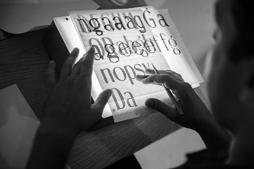
Even when the final product will be digital, sketching by hand is a great way to quickly explore letterform options. Photo by John Hook.
Legacy of Letters vector drawing by CJ Dunn, based on hand drawn lettering by Tony Di Spigna.
You’re one of the few type designers from Hawaii. How does that influence your work?
I grew up near downtown Honolulu—which is actually a real urban center with lots of unique culture—and, like most kids there, I had the sense that all the coolest things came from Japan, which has a big cultural presence in the islands. One of my earliest memories of this was when my dad brought me back a digital watch with a radio function, a wooden puzzle box, and a magic trick with instructions in Japanese that I figured out from the pictures. All of this fascinated me to no end. Later, I studied abroad in Tokyo. Learning Japanese, I was introduced to Hiragana, Katakana, and Kanji, which made me think differently about language and communication, but the influence on my work really comes from the culture’s spirit of innovation. In Tokyo, I took a Sociology of Culture class which examined the “social impact of the Sony Walkman.” We discussed how this was one of many examples where the technology wasn't invented in Japan, but they perfected it. I associate Japan with this constant striving for perfection through improving their products and their means of production. Attention to detail and a focus on rethinking the design process is something I strive for. For the record, Berton Hasebe is also from Hawaii and his work alone puts Hawaii on the map as a typographic force to be reckoned with. He’s one of my favorite contemporary typeface designers and an all-around great guy.All type designers these days have to deal with technology, but you seem to be more enthusiastic about it than most. You’re always trying new things, like writing RoboFont extensions, or releasing the first commercial variable font. Where does this bond with tech come from? Were you into programming at a young age?
When I was a little kid, I always wanted to be an inventor. I tinkered with electronics. I took an old Betamax player and used the mechanical components to make things happen, like getting a sign to pop up. I always tried to reengineer the stuff around me. So I gravitated to computers early on. In type, once I studied with Andy Clymer at Type@Cooper, I embraced Python scripting for type design. As Petr van Blokland says, if you can automate the repetitive parts of your process, you can give yourself more time to design. I got much better at that while working with David Jonathan Ross at Font Bureau. With his guidance, I learned how to build tools to solve problems with building complex font families, or to proof webfonts in an efficient way.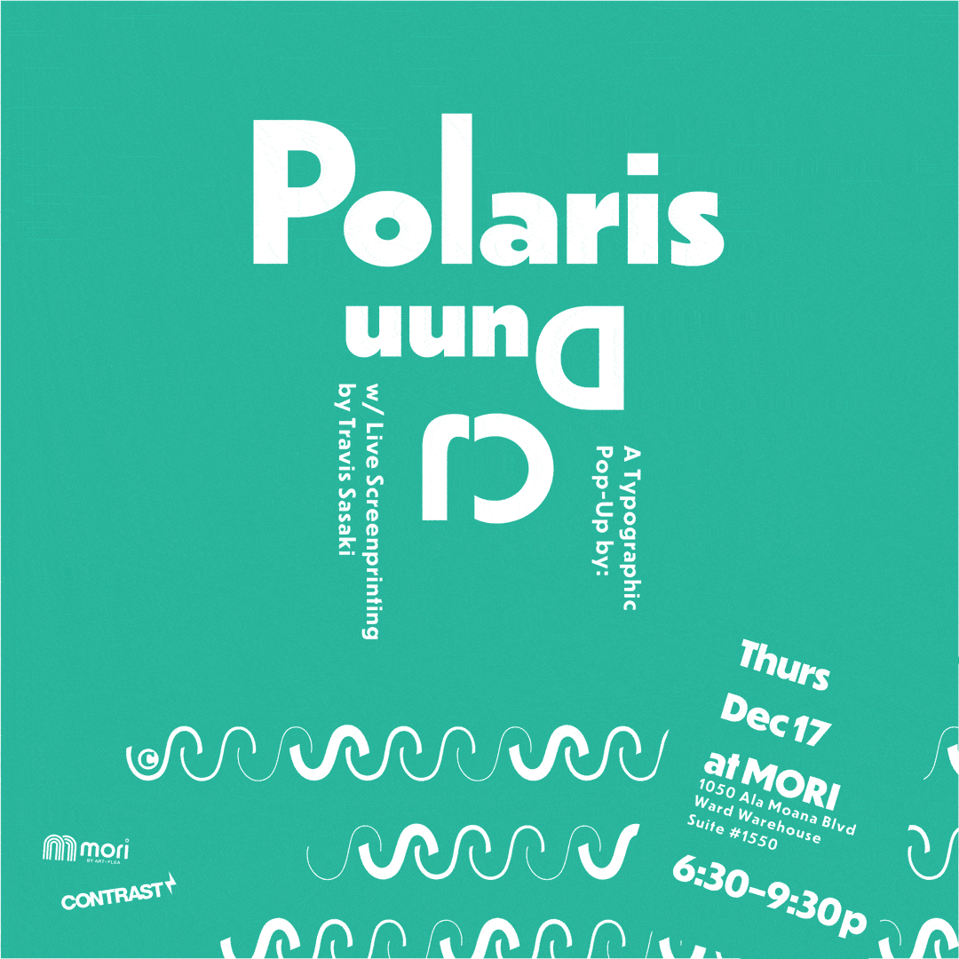
Polaris: a typographic pop-up exhibition by CJ Dunn at MORI in Honolulu, Hawaii (2015).
In your personal biography, you describe yourself as a graphic designer first. Is that on purpose? Are you more of a graphic designer than a type designer? Do you think it’s important for a type designer to also practice graphic design?
I do think of myself first as a graphic designer. I approach type design from a graphic designer’s perspective. I think of the typefaces I would want to use. I want to design things that inspire interesting typography. I’m surprised at the number of type designers that don’t want to be involved in graphic design and actively disclaim themselves of the discipline and have no interest in using fonts. For me, that’s not the case at all. I’m very interested in continuing to do graphic design. It gives me new ideas for typefaces. I think about my work while it’s in progress. My type design is able to react based on information derived from testing it in a real context. I try to use my typefaces as much as possible while I’m designing them so I can see how they’d work for other designers.What’s your favorite and/or most difficult challenge to tackle in type design?
I am into this idea of functional experimentation. I always want to try new things, but I come at it from a functional perspective. It has to have a practical purpose. What can you do with it? How can you apply it? I am not interested in purely conceptual explorations that don’t somehow connect back to the real world. I feel like the typographic design space is vast and we’ve only explored a small amount of it. We’re on the surface of the ocean and there’s the huge depth below. So, for me, it’s a challenge getting under that surface, and getting lost, but eventually anchoring that back into something that works back in the real world. Another pivotal moment for me was reading Noordzij and then studying with Hannes Famira. In a weekend workshop, he showed us Noordzij’s sketching method and showed me how those theoretical ideas actually translated into practical methods for my type design. The TypeCooker exercise focuses on the fundamental characteristics of type, so one can freely explore possibilities rather than being bound by historical models.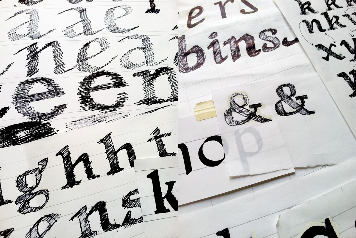
Sketches from Range, designed in the Type@Cooper post-graduate typeface design program (2011).
You’ve worked and continue to work as both an independent designer within your own studio and as a designer at Font Bureau. What have you learned from each experience?
At Font Bureau, I learned a lot about making type commercially and on a large scale. There is an amazing team of brilliant designers, and working on their large families, I was able to learn lessons that I wouldn’t be able to learn on my own. So even if I was doing just a small part of the work on a family, I could see how it all worked together. I’ve worked as an independent designer for over ten years now, and I think that even while being employed by Font Bureau, I’ve still been very independent, as many other Font Bureau designers are. We’re located all over the world, and we meet up virtually and talk about projects, but I think the great thing about working for Font Bureau is having the resources and support of the other designers. I’m excited about that continued collaboration as a member of Type Network. What Cyrus wrote about the benefit of shared knowledge and experience rings true to me.What were your goals with Dunbar?
The impetus was seeing some of the earliest foundry specimens of Erbar from Ludwig and Meyer that Indra Kupferschmid showed me, and I got really excited about seeing this very different kind of geometric sans. I had no plans to do a geo sans, but these schriftkarten excited me about a genre that wasn’t represented well in digital form. One thing that really caught my eye was the way that Erbar worked with the very low x-height that had this vertical rhythm and personality that I really enjoyed. But also, thinking about it from a graphic designer’s perspective, I knew that these proportions would be impractical in many situations. There was such cool DNA in these letterforms which I thought should be usable in a wider range of settings. So in this TypeCooker way of thinking, I thought, “What if I change the x-height parameter?” I pushed that to the extreme and then looked at interpolations in between, thinking I’d pick something in between. But then I realized that this really tall version had a lot of interesting personality and energy in it. I had seen a lot of designs in the middle but not as much at these extremes. Instead of compromising the most interesting designs, I kept both Tall and Low as display variants and designed a more moderate Text variant to work for smaller sizes.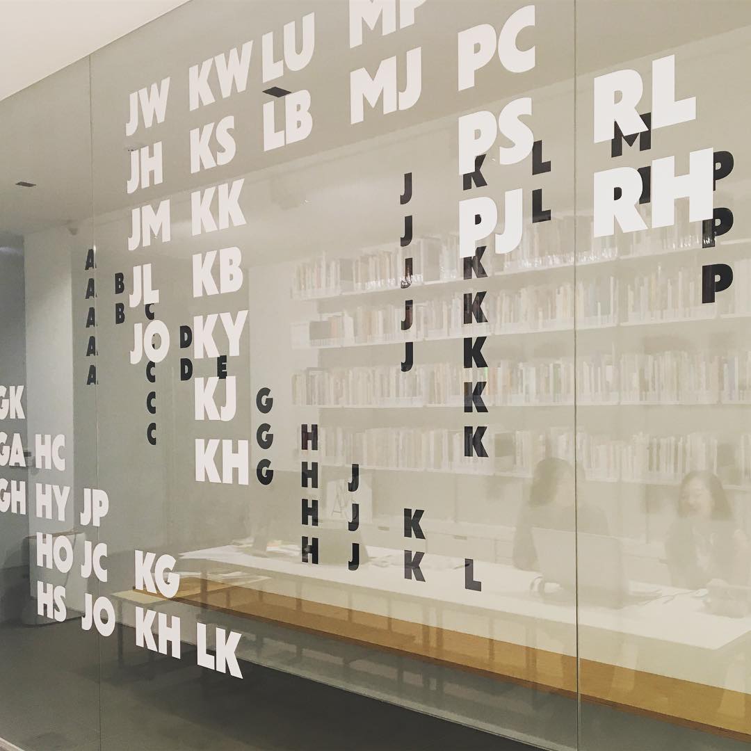
Dunbar in use by designer Na Kim for an exhibition at Kukje Gallery in Seoul, Korea.
Has Jakob Erbar gotten short shrift as an originator of the geometric sans, while Renner gets all the credit?
Definitely. Erbar did get a lot of use in Germany and Switzerland, but was overshadowed by Futura due to a number of factors. Bauer had better distribution and marketing—they even had a New York office, I just learned—and were able to take the world by storm with Futura. The name also helped. So Erbar was overshadowed, but it has really great qualities that I want to make available for contemporary typesetting.Many oldtimers or traditionalists might associate the extra large x-height of Dunbar Tall with 1970s typography and its ITC (International Typeface Corporation) revivals. As a younger designer do you have those associations?
Totally. I experimented with raising the x-height for functional reasons, but once I pushed it to the tallest extreme, it did look like something that I was very familiar with through ITC, knowing Ed. I think it’s not as well represented today as it was in their heyday. And I think there’s a lot of great character there. Once I took a step back, I realized I was doing some historical fiction: “What if there was an ITC Erbar?” They did an exaggerated version of Kabel and other classics which are somewhat of a caricature of the original. And they were put to really great use for a reason. They are a totally valid style of typographic expression that could be used more often today.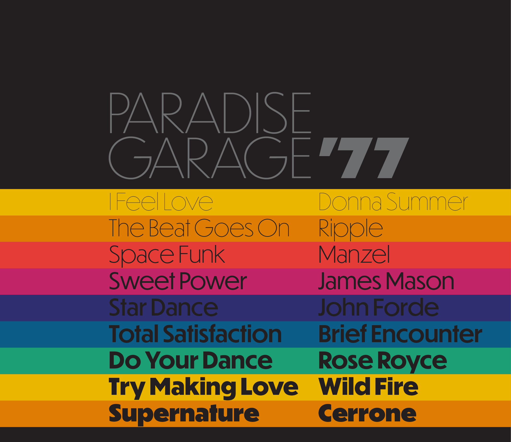
Dunbar Tall, as a piece of historical fiction, draws on the visual language of New York City in the 1970s.
It could be called a proof-of-concept, but you released the first commercial font to take advantage of OpenType Font Variations, a technology that was just announced. How did that happen so fast?
I’m interested in new technology, and I learn by doing. As I watched the announcement at ATypI, I could see the possibilities, but I wanted to understand how it works in practical terms for my own use. The good news is that this way of thinking about the design space and variations is something that type designers are already doing. With tools like Superpolator and interpolation, it’s already part of contemporary typeface design. So I was able to sit down with Erik van Blokland and read the documentation, and he pointed me to info that helped me understand how to make this work with tools I was already familiar with, like Mutator Math. I spent the day hacking tools and going through the process just so I could understand it better, but once I got that to work, I showed some friends and they tweeted the video. The reactions led to producing something tangible. All of this happened because the type community is supportive and encouraging, and they help each other navigate these new technological challenges.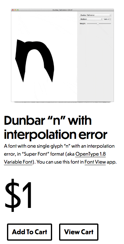
CJ offered an "interpolation error" as the first retail variable font for sale in an attempt to raise awareness about the new format and start a dialogue.
What advice would give to someone who is where you were ten years ago, just getting started in typography or type design?
If you’re struggling with something, write a nice, polite email to someone who knows what they’re doing. Keep in mind, they will respond a lot better if you show that you’re actively trying to solve problems yourself, and you may be coming up against walls, but you are not just sitting back and waiting for someone to tell you what to do. As long as you’re willing to put in the work, many people are happy to point you in the right direction. Also, being part of the community is important. Go to events, go to conferences, be engaged. I am lucky, being in New York City where there are always type events happening. So, especially if you’re in a large city, meet people. Type people are generally friendly. I was surprised early on when people were so friendly to me when I was just starting out and was able to talk with designers I admired. I agree 100% with what David Lemon said during his retirement speech at ATypI 2016 in Warsaw: “There are remarkably few jerks in this industry.”What should people think of when they think of CJ Type?
I have no design manifesto. It’s just me. CJ Type is just me. It’s the work that I make. I bring to it my perspective and experience and all the influences I've collected from life and work.See the first CJ Type release: Dunbar.
Dunbar in use from the Polaris typographic pop-up by CJ Dunn at MORI Hawaii.